![]()
Overview
As of this posting, HarbourView Equity Partners is a globally recognized multi-strategy investment firm with an asset portfolio of more than 24,000 song titles, but when we got involved it was just a remarkable idea in founder Sherrese Clarke’s imagination. Creating the branding for the upstart company presented us with a new and intriguing problem: With the landscape of private equity firms littered with dark blues and greens, well-established colors that evoke trust and money, how does a newcomer show up, fit in, and yet still manage to stand out?
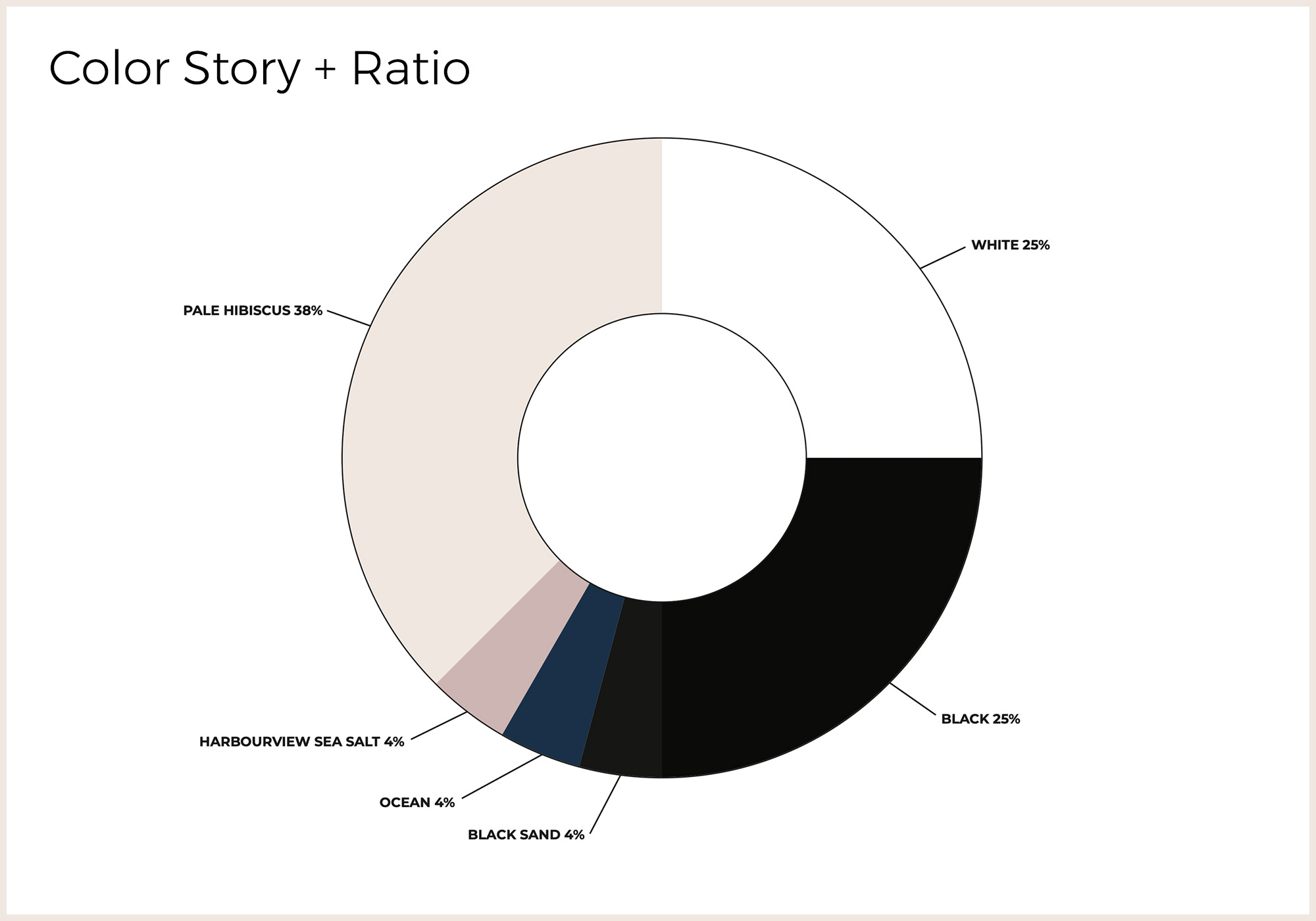
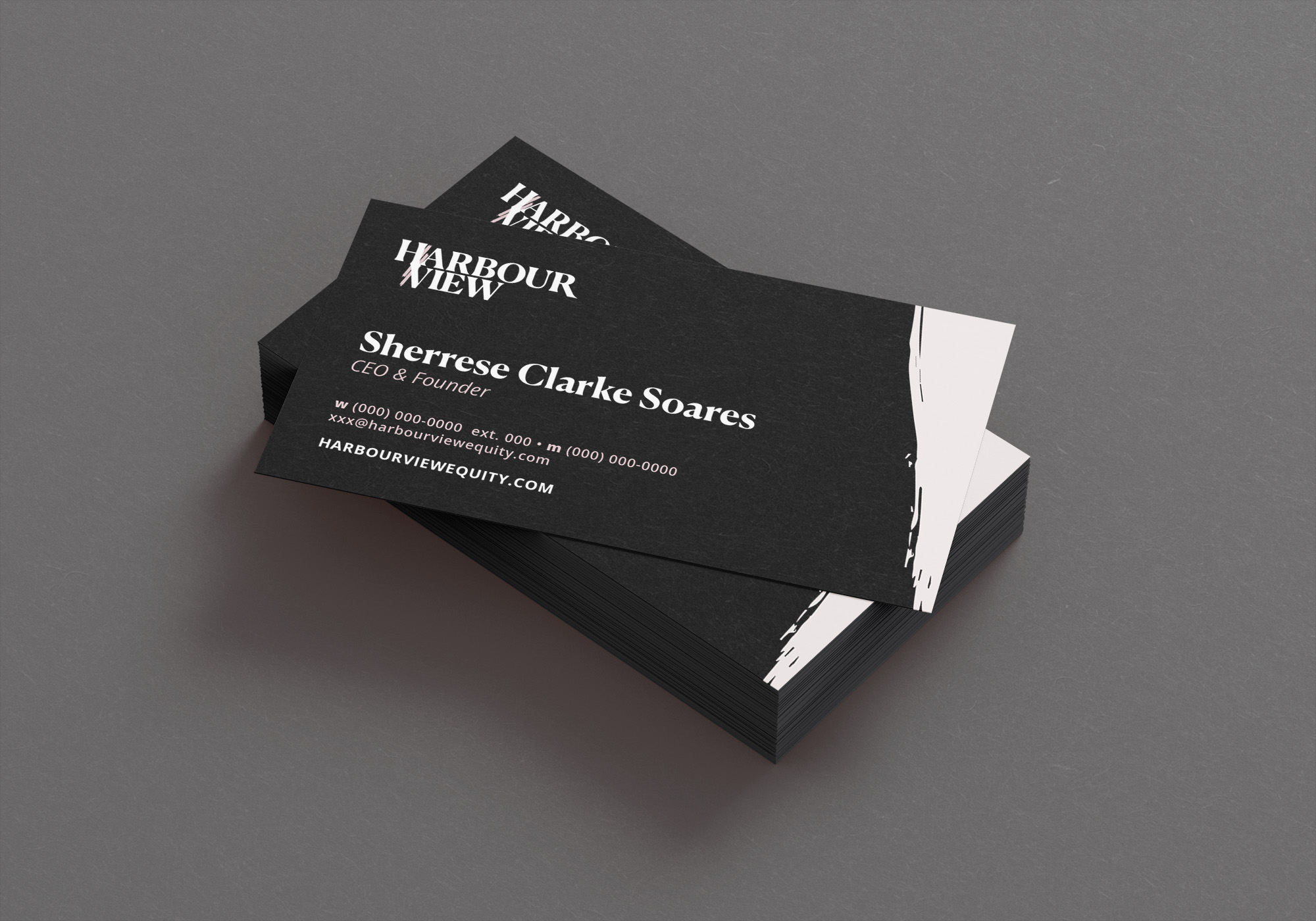
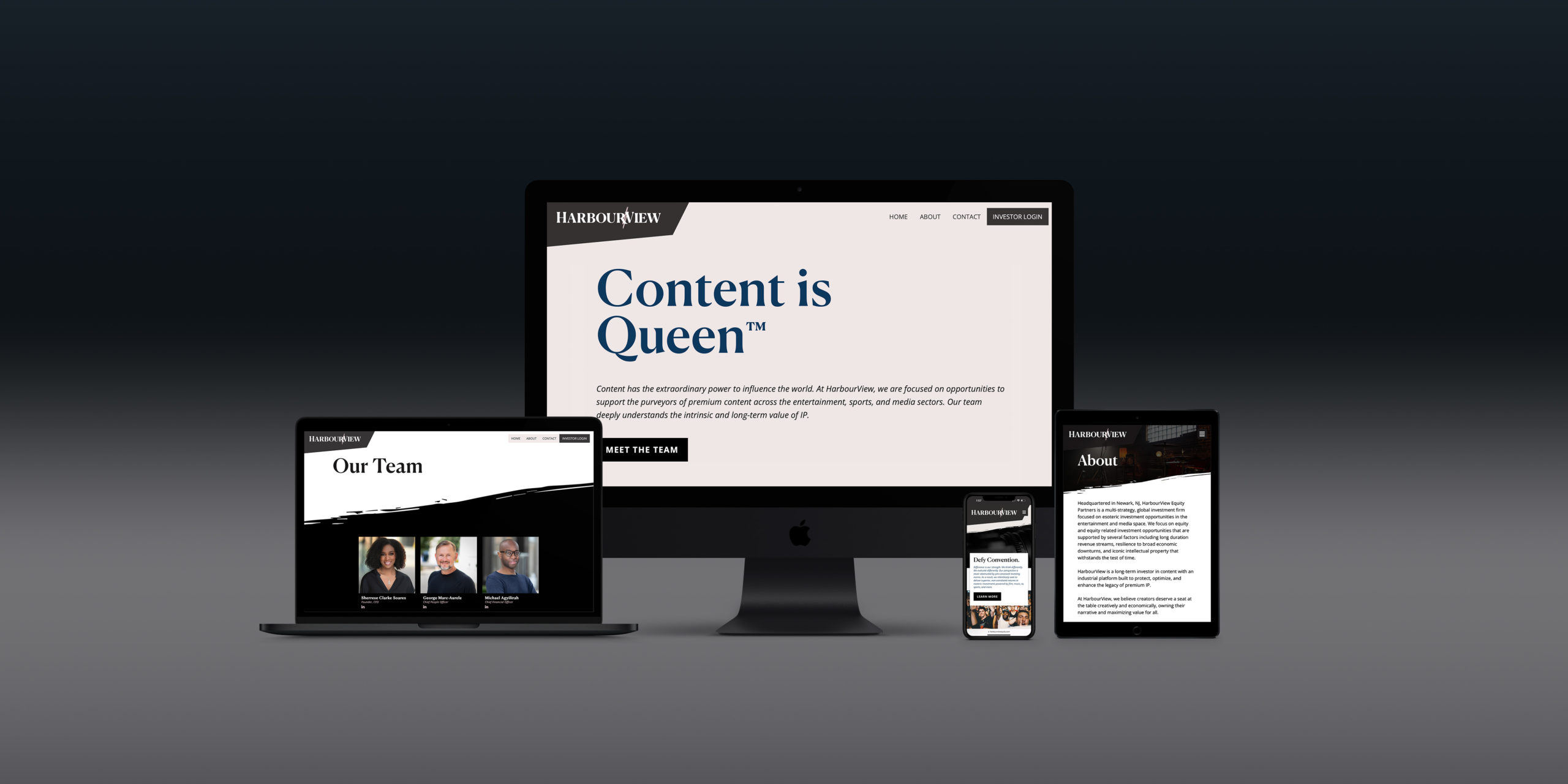
Considering HarbourView would need to appeal to partners in the ever-changing, youth-obsessed music industry, we developed a color palette that defied convention while also emanating a sense of strength and calm. Many women-owned firms are reluctant to use pink for fear of seeming too feminine or soft, but for HV’s branding we convinced the team to resist antiquated and gendered stereotypes around the color. Our vision centered on a pale millennial pink (Pale Hibiscus) as the dominant hue, popping elegantly against large swaths of white and black. We combined those colors with accents that reflected the tranquil beaches of Clarke’s Jamaican roots: HarbourView Sea Salt (a slightly darker pink), Ocean (a dark blue-green), and Black Sand (a very dark gray). These color combinations allowed for the high-contrast designs we used in creating the HV website, business cards, and presentation decks, and later inspired the interior decor of the firm’s sleek offices in Newark, NJ. The resulting visuals not only reflect our pride but also align with HarbourView Equity Partners' impressive achievements, reinforcing their company motto: Content is Queen™.