Overview
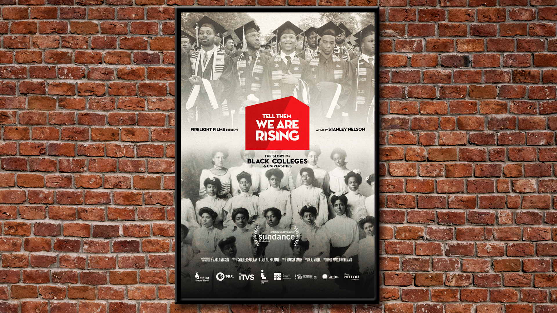
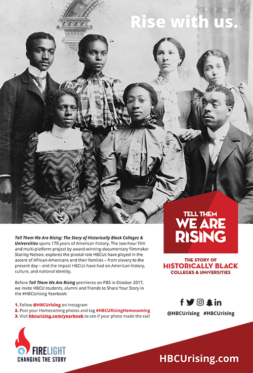
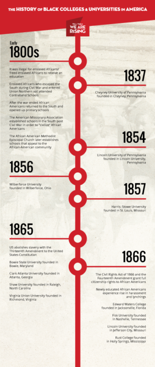
Our struggle was twofold: to balance the rich history of America's historically Black colleges and universities (HBCUs) while also feeling modern, and to connect this documentary graphically to other entries in the "America Revisited" series. Starting with tons of research, we surveyed HBCU logos and other prominent Black organizations to find patterns among them — a base for which to create a visual language singular yet familiar. We developed the identity around the idea of a keystone, to convey the durability of HBCUs and the weight of their role in the American experience, and angled the logo to subtly reference the "rising" of the title. These elements are represented again throughout the collateral, along with some of the rougher details from the other "America Revisited" movies.
